From 1st April to 31st October 2019, the second edition of the “Cambiamo Marcia” Project organised by the City of Cesena Council took place, and over 300 citizens were able to claim an incentive of € 0.25 per kilometre for cycling to work.
The Council’s aim was twofold: on one hand, it wanted to spread the good practice of active mobility; on the other, it aimed to collect quantitative information on the routes most frequented by cyclists, and visualize them on shareable online maps.
As a technology partner in the project, Wecity was already able to record and validate the routes taken by users.
The second objective, however, presented a series of significant difficulties which, given our propensity to complicate our lives, we immediately found irresistible :-)
In this post, we describe how we created some of the visualizations we made available to the Council.
The first obstacle: map-matching
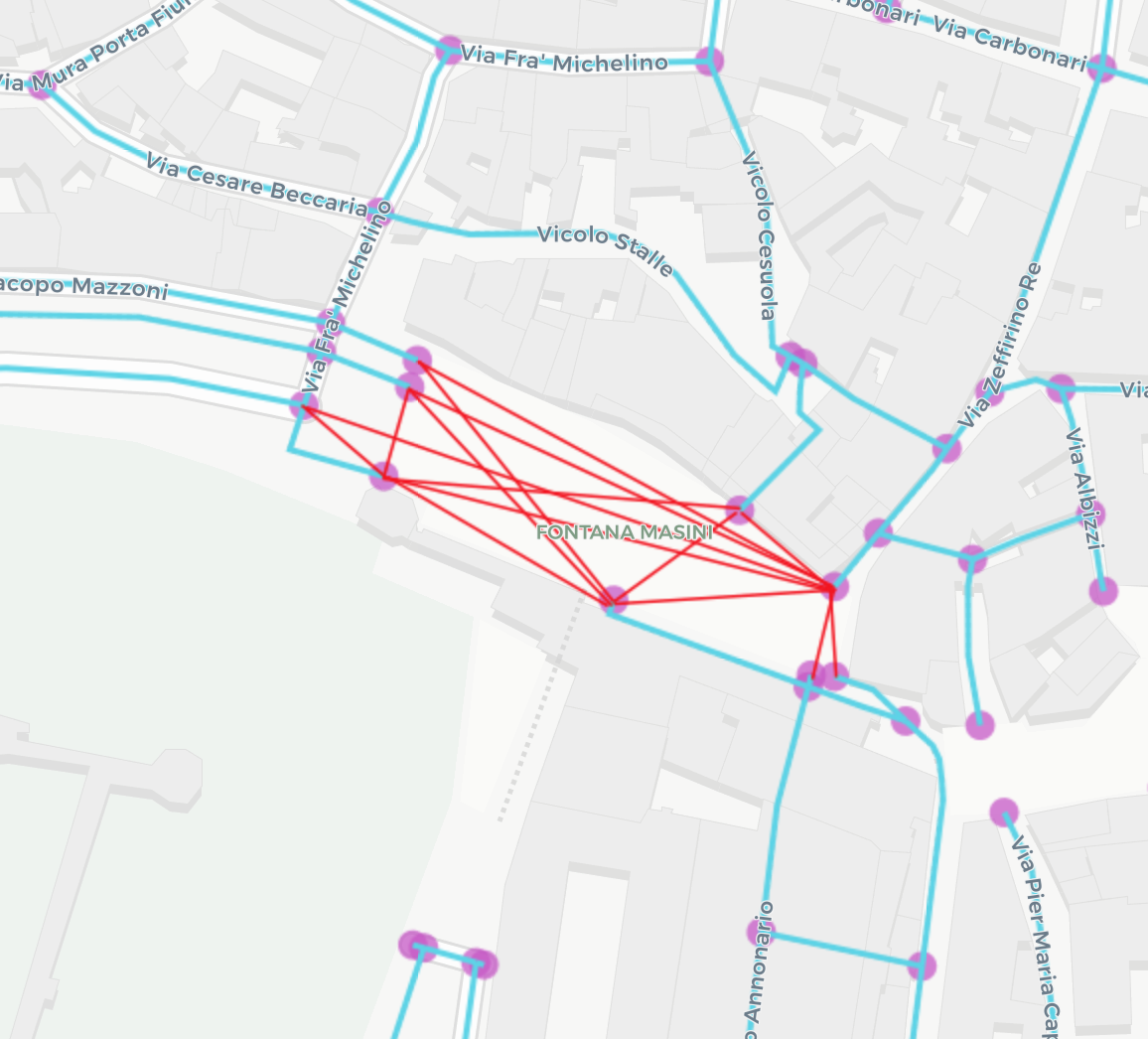
When you have GPS data for different routes, the most common approach is to draw maps like the one below.
By directly plotting the raw data (obviously anonymised), hundreds of lines can be obtained that provide qualitative information on the number of trips in a given period of time.
The more lines, the greater the space they occupy on the screen, creating a graphic effect whereby the lines become thicker and darker at the busiest road axes.
Further effects, such as heat maps, can then be drawn upon. Unfortunately, this method does not provide any numerical nformation relating to a particular street, let alone a stretch of a street.
That’s where map-matching comes in.
Map-matching consists in snapping a series of geographic coordinates to a topological model of the real world, typically a GIS system.
For example, we can transform the yellow line into the green line, as in the image below.
Why is map-matching so important? Once transformed, the GPS tracks can be perfectly superimposed and therefore become quantifiable, generating the desired numerical information.
We initially opted for map-matching algorithms already available on the market, which can be used in SAAS mode. However, we soon encountered a problem: they are all optimised for the car!
In practice, when we feed the algorithm a series of GPS coordinates, and none of these coordinates is really on the road axis (indeed, sometimes, a point can be inside a building or in a street that has not actually been travelled along), the algorithm understands that the user cannot have passed through buildings like a ghost, and must decide which road they used.
In doing so, available algorithms apply typically automotive parameters: choice of the fastest route, no U-turns or lane changes (which a cyclist can perform safely at pedestrian crossings) or traffic going in the wrong direction (sometimes allowed for cyclists, sometimes not. But that’s not today’s topic.)
At this point, we decided to develop a map-matching algorithm from scratch that mainly had the cyclist in mind.
After several weeks of development, we created a satisfactory first version, with which we mapped a first sample of about 100,000 trips in 4 different cities, with an accuracy of about 92%.
The second obstacle: the road graph
By studying the first sample, we realised that the accuracy always dropped in the same areas of a given city, and that very often these areas coincided with the principle squares of the cities.
In practice, the algorithm was unable to trace a user’s route across a square, which is probably the favourite route for a cyclist, even in cities that are not particularly bike-friendly.
In other words, the square does not exist in the logical model used by the algorithm. And once again, the reason was the automotive emphasis. It is all very clear from the map below.
Since Piazza del Popolo in Cesena is pedestrianised, the graph is interrupted and the 8 streets that lead into the square are treated as dead ends.
A similar thing happens with streets that are too narrow for motor vehicles, such as arcades, etc.: in short, all those places that make the historic centres of cities wonderful and intriguing.
The solution in these cases is to add the missing edges, connecting each point to all the others so as to make the routes taken by cyclists across the square possible.
Since it would be unthinkable to manually search for the missing parts in each city, we used the algorithm’s lack of accuracy as an “alarm” signal to automatically generate the missing grid for each area.
The interesting thing is that this approach also highlights the so-called “desire lines”, on which we will soon write a specific post.
With this correction to the road graph, the performance of the map-matching algorithm went from 92 to 98.8%, relegating errors to marginal situations.
Static visualizations
We now have everything we need: the raw data from the routes; the original road graph; and the “cycling” corrections to take into account the peculiarity of these movements.
For privacy reasons, we introduced 2 last corrections to eliminate the first and last metres travelled by the user, who therefore starts and arrives from the intersection closest to the start and finish of the trip.
The result is that we can now superimpose the cycle routes for each element of the road graph on the individual GPS tracks.
[/one_half] [one_quarter last=”yes”][/one_quarter] [one_quarter last=”no”][/one_quarter] [one_half last=”yes”]By hovering the mouse over the pink lines, it is possible to see the numerical information which, in this case, relates to both the total number of trips and the number of unique users in the period of time under consideration.
The widgets on the right allow you to filter the road axes based on the values above.
Starting from here, it is possible to develop even more analytical dashboards to study the traffic flows, or to generate animated visualizations with the main objective of communicating them.
Animated visualizations
In animated visualizations, one additional element is obviously required: time.
To make the animation fluid, it is necessary to further manipulate the data so as to make the greatest number of segments to be animated at the same time coincide on the same frame.
The result is the map below. Once you press play, you can play with the animation speed by changing the number next to the missile icon at the bottom right.
Furthermore, by dragging the two cursors below the histograms, it is possible to increase or decrease the plotted time span.
[/one_half] [one_quarter last=”yes”][/one_quarter] [one_quarter last=”no”][/one_quarter] [one_half last=”yes”]
The animated map has a mainly communicative and non-analytical value: however it is able to clearly and intuitively visualize some important elements, such as the spatial and temporal distribution of travel, the peak times, the departure and arrival areas, etc.
Conclusions
Wecity has adopted a completely in-house approach which, starting from raw data relating to cycling in urban areas, generates rigorous numerical data on the road axes of the city, viewable in static and dynamic interactive maps that can be shared online.
We would like to make this approach available to other organisations: if you are an urban planner, a mobility consultant or a transport councillor and want to know more, get in touch with us and let us know what you think!
[/one_half]